Earth Connected: How We Rely on the Earth and Each Other
Is Climate Change Making Hurricanes More Powerful and Frequent?
MINDS ON
Oceanographers study the complex systems that distribute heat and moisture around the planet. Recent studies by these experts have suggested that climate change is impacting ocean systems with global implications. Hurricanes are born in the ocean and feed off of their offerings of heat and moisture. So what happens when hurricanes are offered a larger meal of heat and moisture?
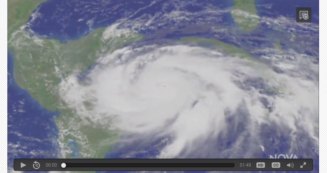
 The Effect of Sea Surface Temperature on Hurricanes
Fill out this organizer to make predictions before, during, and after you watch the video.
ACTION

Scientists use many tools to gather and analyze the data from which they draw conclusions. The average person believes that scientists’ findings are accurate, but it is important to develop the skills to analyze data for yourself. The collection of primary data allows you to collect this data and is often most effective because you are able to control the quality of the data; secondary data requires less effort and can offer equally accurate information:
In General:
| Primary Data data collected by you |
Secondary Data data collected by others |
|---|---|
Advantages
|
Advantages
|
Disadvantages
|
Disadvantages
|
Examples related specifically to hurricanes:
| Primary Data Sources | Secondary Data Sources |
|---|---|
| Ocean data buoys- scientists personally install data collecting instruments in hurricane prone areas to collect data such as wind speed, wave height, water temperature, and atmospheric pressure for their own research. | Using maps, satellite imagery, tables, graphs and other data that has been collected by an organization or someone other than yourself. |
Here is some more information on understanding the difference between primary and secondary data sources.
We will use secondary data on hurricanes to answer the inquiry question.
In order to answer this question we will be using a spreadsheet program to statistically analyze hurricane data. You used a spreadsheet program back in Unit 1 Activity 3 to create graphs but what you haven't done is use formula functions to mathematically analyze data.
Let’s get started:
Hurricane data has been collected since the the 1850’s which offers us 166 years to identify long term trends. Download this dataset and open in a spreadsheet program of your choice.
A spreadsheet program offers the choice to create “sheets” which appear as tabs along the bottom of the page.
Microsoft Excel look:

Google Sheets Look:

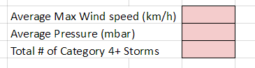
Both programs offer the same functions and overall user abilities. If you click through each tab you will see that data exists for 50 year periods starting in 1851 and extending to the present day. It will be your job to look through each sheet and perform some simple analysis in the areas colour coded pink as seen below.
|
|
Use this tutorial to learn how to calculate totals and averages as well as creating bar and line graphs.
 Geographic Data and Information
Complete the following tasks in your spreadsheet:
- Calculate the average max wind speed in km/h, average pressure and total number of storms for each of the time periods (1851-1900, 1901-1950, 1951-2000, 2001-Present)

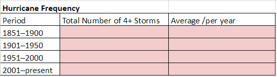
- Transfer the total # of 4+ storms for each time period over to the table in the sheet labelled “Comparison Statistics”
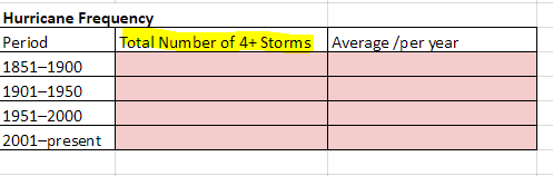
- Calculate the average / year. Remember you will need to take the # of storms and divide that total by the number of years in the time period. The first 3 will be 50 years and the last will be 16 since we have yet to reach 2050.
- Create a bar graph that shows monthly trends for when most large Atlantic hurricanes strike.
- Create a line graph that shows the trends in the number of storms per year for the time periods.
- Create a line graph that shows the average max sustained wind speeds for the time periods.
- Create a line graph that shows the average minimum pressure for the time periods.
- Save your spreadsheet with an appropriate name.
Once you have completed all of the statistical analysis and data visualization (graphs) you are done this section.
As you complete the tasks in your spreadsheet, please consider the following success criteria:
CONSOLIDATION
Armed with a wealth of information relating to the frequency and power of Atlantic Hurricanes, we can finally answer the question:
Drawing conclusions should be easy once you interpret the statistics and graphs you created.
Is Climate Change Making Hurricanes More Powerful and Frequent?
Your consolidation task is to draw conclusions based on your work and communicate this information using a method of your choice.
Conclusion choices can include:
- A video recorded news report / interview detailing your findings;
- An audio recording discussing your findings (Can take the form of a radio news spot);
- A written news article (Such as one you would read on a news website like cbc.ca, a magazine like National Geographic, or in the science section of a newspaper);
- Any other form of expression in which you can communicate your findings. (i.e a short story, song, cartoon/ comic, rant (Rick Mercer style), etc.);
Strategies for Making Great Conclusions:
- Begin by restating the inquiry question or goal of your study.
- Discuss how you gathered the information that enabled you to make your conclusion.
- Take time to discuss the relationships, patterns and trends discovered in the data analysis.
- Make clear connections between the findings of your statistical analysis and your conclusion. (Effective conclusions use the data to support findings)
- Insert screenshots of one or more of your graphs/tables and explain how the trends communicated in the graph help support your answer to the inquiry question. (If you include graphics, be sure to discuss them)
Go back to your spreadsheet and use it to fill in this document that helps organize your findings and then answer the inquiry question.
 Consider this: