Travelling Like a Geographer
Interrelationships: How does it all fit together?
MINDS ON
It’s a Big World…
How long would it take you to travel to every country in the world? And how much do you think it would cost? Take your best guess!
To see the story of one person who visited every country in the world, check out the video below. As you watch, remember a few things. First, she currently holds the world record for the shortest timespan in which a person has visited every country, and second, she is afraid of flying.
Of course, both the cost of the journey and the length of time required to travel will depend on the way that you choose to get from point A to point B. Often these factors demonstrate an inverse relationship - the more you pay, the quicker you get there. While this is convenient, most people have to balance time and budget while travelling.
Off the Beaten Path: Counting On
Do you know, off the top of your head, how many countries there are in the world? While this seems like it should be a pretty straight forward question, there is actually a good deal of debate on this topic!
Have the number of countries in the world changed over the years? Why is that?
HowManyCountries
ACTION
Modes of Transportation
![]()
If you were to brainstorm for a moment, you would be able to think of a number of different modes of transportation that are used by the travel and tourism industry. Flying, driving, and cruising would likely come to mind quickly. After a moment you would likely add hiking, cycling, and maybe others, such as riding the train or bus. In fact, sometimes the mode of transportation can BE the trip. For example, cycling through France, riding a train through the Rocky Mountains, or taking a cruise through the Caribbean are all just as much about the act of traveling as they are about the destination.
Not all of these options are available from all places, however. You may live in a city where you can walk a few blocks and access public transport that would take you right to the airport where you could catch a flight out. You may also live somewhere that you have to drive a long way to get anywhere because there are no other transportation services available.
When planning a trip, one of the first things that you have to consider is how you will move between places. In some cases it’s obvious (intercontinental travel likely involves a flight), and in other cases you have a number of options (London to Paris might be a flight or a train ride, or a drive in a rental car). Where there is choice, how do you decide? Which factor is more important to you?
Environmental Factors
Economic Factors

Social Factors
Physical Factors
Political/Governmental Factors
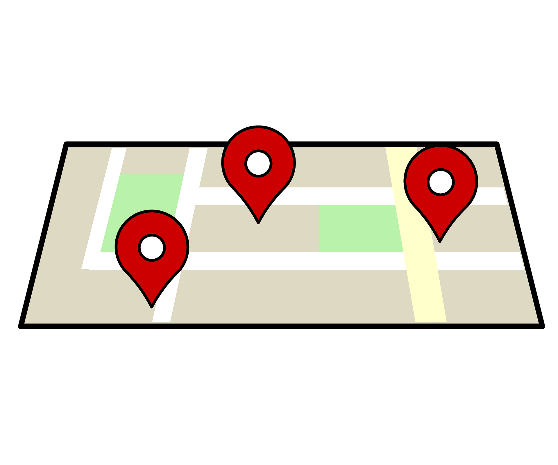
Getting from Point A to Point B
Many mapping apps will not only help you get from your current location to your destination, but they will also help you decide on your mode of transportation by offering different options.
Using Google Maps, for example, you can see that if you wanted to travel from Ottawa to Toronto, the following options are available:

Consider This: So Close, but Yet So Far
Throughout this course, you will find this icon and tasks labelled ‘Consider This.’ These tasks will ask questions that require you to consider the information you have learned, and to perhaps do some research as well, with the goal of making connections and thinking outside of the box.
Just because two places are close together geographically does not make travel between them easy. In Google Maps, or another similar app, enter Punta Arenas, Chile as your current location, and Antarctica as your destination. Why do you believe the results are what they are?
Off the Beaten Path: Having Faith
A word of caution - do not always trust your mapping app. Sometimes, a bit of common sense is needed as well.
 Going the Distance
Select two different locations on the same continent (locations that don’t involve crossing an ocean) and use a mapping app to study the different possibilities for travel between the two places.
Note: You may wish to select larger cities so that flying is also an option.
In your Teavel Journal. discuss your findings. Use the following questions to scaffold your answer.
- What are the pros and cons of each transportation option?
- Which mode of transportation would you ultimately select for this trip and why?
- Which mode of transportation would you select if you were considering:
- Environmental Factors
- Economic Factors
- Social Factors
Concepts of Geographic Thinking: Interrelationships
Just as you studied Spatial Significance in the first activity, and Patterns and Trends in the second activity, this activity is centred around the concept of Interrelationships.
GTConceptsI
It’s important to make a few distinctions between terms before beginning.
Contributing factors: while they can influence an outcome, they do not guarantee or determine a specific result. For example, a beautiful beach, good food and great weather do not necessarily guarantee a perfect vacation.
Determining factors: this will determine a specific outcome. For example, a thunderstorm moving through the area will delay flights.
Determining Interrelationships
There are four different possibilities when comparing two factors:
- A influences B;
- B influences A;
- A and B influence each other; or
- A and B have no influence on each other.
To relate this to travel and tourism, one of the best examples is the price of flights.
DeterminingInterrelationships
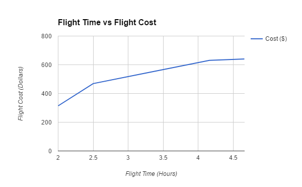
Now that the data collection is complete, it’s time to look at the interrelationships that have been uncovered. Below you will see both a visual representation and a written explanation of this interrelationship.

Interrelationship: B influences A (Distance Influences Cost)
Result of Research: Through research, a general pattern is demonstrated which indicates that the longer the flight, the greater the cost.
Explanation: Reasons to support this may include the fact that the greater the distance travelled, the greater the amount of fuel that is needed. It is also true that for a longer flight, more money is being paid in salaries to the flight crew. Also, if an airplane needs to make a certain amount of money in a 24 hour period to remain profitable, then the longer the flight, the greater the proportion of the day’s earnings must be represented by that flight.
Discounting other Interrelationship Options: The cost does not determine how far the flight will travel, meaning that this cannot be A influences B or A and B influence each other. Because a connection has been demonstrated, this is not a case in which A and B have no influence on each other.
 Questions
The following questions will give you an opportunity to practice applying the concept of interrelationships. If you answer a question incorrectly, be sure to read the feedback. You may wish to re-read the content or work through the example again before beginning.
- Factor A = Burning fossil fuels and Factor B = Melting glaciers
- A influences B
- B influences A
- A and B influence each other
- A and B have no influence on each other
a. A influences B
Burning fossil fuels causes more greenhouse gasses to build up in the atmosphere, which in turn means that more heat is trapped. This trapped heat raises the global temperature causing the glaciers to melt more than they would at a lower temperature.
- Factor A = stricter penalties for poachers and Factor B = increased number of tourists taking part in safaris
- A influences B
- B influences A
- A and B influence each other
- A and B have no influence on each other
c. A and B influence each other
If there are stricter penalties on poachers, there will be more abundant wildlife in the region, making it a more viable safari option. As well, if there is increased tourism, there may also be more attention (tourists and media) in the area which may lead the government to take additional measures to protect the wildlife.
- Factor A = A volcanic eruption in South America and Factor B = Commercial flights in Europe
- A influences B
- B influences A
- A and B influence each other
- A and B have no influence on each other
d. A and B have no influence on each other
While a volcanic eruption would cancel air travel in the vicinity, it would not impact flights halfway around the globe.
- Factor A = the number of people that cross the bridge that connects Sault Ste. Marie, Ontario to Sault Ste. Marie, Michigan and Factor B = the exchange rate between the American and Canadian dollar
- A influences B
- B influences A
- A and B influence each other
- A and B have no influence on each other
b. B influences A
If there is a favourable exchange rate (e.g., a strong Canadian dollar), Canadians have more purchasing power in the United States, and therefore will choose to both vacation and shop in the U.S.
Work With It: What’s the Interrelationship?
Select one of the pairs of factors below to use in your own exploration of interrelationships:
- Crime (i.e. pickpocketing) and major tourist sites
- The price of souvenirs and peak tourist season
- The cost of admission to an attraction and how popular the attraction is
- The price of a flight and the volume of travel through the airport (i.e. how busy an airport is)
- The friendliness of the locals with the country of origin of the tourists
- The access to familiar services (i.e., North American chain restaurants or hotels) and the proximity to your home country
- Costs of all-inclusive Caribbean vacations and proximity to hurricane season
- Local worker wages and the cost of food and accommodations
- Wealth of the traveller and the ecological footprint that their vacations leave
- The natural features of the landscape and the activities offered
Present your reasoning for which type of interrelationship (i.e. A influences B) is represented between your two factors. Picking one of the examples above, you may choose to explain your thinking in paragraph format or through a visual representation.
It is important to note that interrelationships may involve more than two factors. For example, a lodge may be built by a lake in Northern Ontario to take advantage of beautiful views and great fishing. However, the amount of rainfall will determine the depth of the water and will impact fishing. It could also determine how accessible the lodge is by road, as flooding from excess rainfall may limit guests from reaching it.
Inquiry
In previous lessons you looked first at Questioning and then at Gathering and Organizing information. The next step of the inquiry model that we will practice involves Interpreting and Analysing your data.
InquiryProcess
Interpreting and Analysing Data
This part of the inquiry process is all about making sense of the information that you find. Quite often, the information will be in a format that is less than ideal - for example, an article with statistics contained within it. Those same statistics, presented in a more visual way, become much more meaningful for the reader.
Take, for instance, the data set that was used as an example in Activity 2. This information looked at which countries represented the largest groups of tourists to Canada.
Table
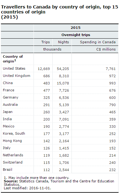
There is a good deal of information in this table, and if you spend a bit of time looking at it, you can likely find the patterns and trends. However, this doesn’t make a table the best option for analysing this data.
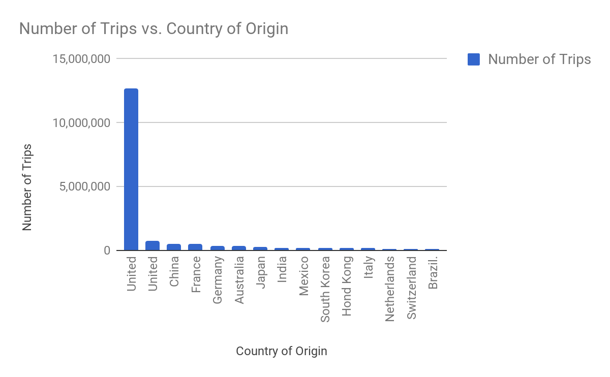
Consider the very same information transformed into the following formats:
Bar Graph
Map
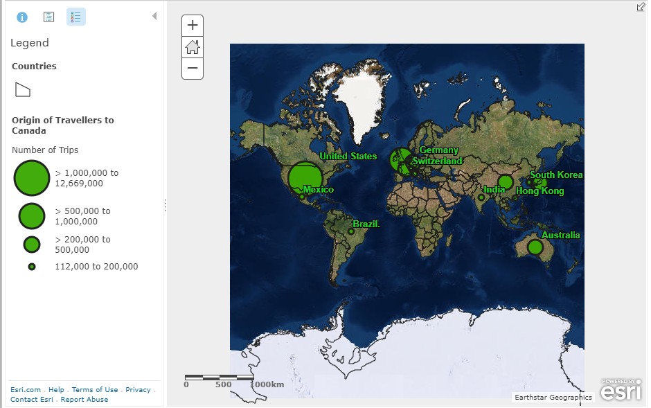
The various methods of displaying data have different advantages and disadvantages. Choosing the proper format needs to be done carefully.
|
Table/Chart/Spreadsheet 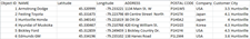 |
Map  |
Graph  |
|
|---|---|---|---|
| Advantage | All information is in one place for easy access and reference. | It shows location, proximity, and relationships to other features on the Earth. |
This helps to visualize differences and changes over time. |
| Disadvantage | Specific information is hard to find on big tables. They do not show location well. | It is not always possible to show all information at once. |
It is not always possible to show all information, especially in exact locations. |
Have the number of countries in the world changed over the years? Why is that?
 Work With It: I Vote For…
Which of the above options do you believe is the most meaningful representation of the data? If you were asked to think about this data and look for patterns and trends or evidence of interrelationships, which format would you choose? Why would you make that choice?
Consider This: To Be or Not To Be?
In the Mind’s On portion of this lesson, you watched a video that debated the number of countries in the world.
Interestingly, the video explained that Hong Kong is technically a Special Administrative Region of China, and not a country at all. Yet, Statistics Canada, our national source for reliable data and one that passes the CRAAP test, has listed Hong Kong as one of the most popular countries of origin of international visitors.
Why do you believe Hong Kong made the list? Was it an error?
Work With It: Considering the Options
Return to the data that you collected in Activity 2 regarding a country of your choice, and look at either the international visitors or the most popular tourist sites in that country. You submitted this to your teacher as part of the previous activity.
For this task, you are asked to manipulate the data and share it in a different format (i.e. a graph or a thematic map). Perhaps you will choose one of the options shown in the example above, or you might choose a different method entirely.
Below your new representation, explain why you believe it to be a meaningful representation of the data and how it will be helpful to you in the next phase of the inquiry process - Evaluating and Drawing Conclusions.
Note: You may wish to create these using a spreadsheet application, or you may wish to create them by hand and then upload a photo of your work.
Checklist - Considering the Options
| Yes/No |
Criteria for Which Your Teacher Will Look: |
|---|---|
|
Format selected (e.g., map, table, chart) to display data has been constructed with a high degree of attention to detail. |
|
|
Geographical terminology and concepts are applied with a high degree of accuracy. |
|
|
Logical ideas are communicated with a high degree of clarity. |
Bias
One final, but important, part of the Interpret and Analyse phase of the inquiry process is looking for bias in your information.
One of the key reasons that the CRAAP test is beneficial to your research is because it helps you to select reliable sources that are trustworthy; however, this doesn’t always guarantee that the information is free of bias.
Bias is a phenomenon that comes into play in all areas of life, not just travel and tourism. It is defined as having opinions or feelings that are determined without full consideration of all available facts and information. Anything we read or view about a destination, especially a traveller’s personal experiences, are subjective and therefore can contain bias. This doesn’t mean we can’t use the information; it just means that we need to be aware of, and on the lookout for, potential bias.
CONSOLIDATION
Island As A Stopover
The chart below contains statistics on the number of international tourists that have travelled to Iceland between 2007 and 2016. Source
|
Year |
Total # of visitors |
|---|---|
|
2016 |
1,792,201 |
|
2015 |
1,289,140 |
|
2014 |
997,556 |
|
2013 |
807,349 |
|
2012 |
672,773 |
|
2011 |
565,611 |
|
2010 |
488,622 |
|
2009 |
493,940 |
|
2008 |
502,300 |
|
2007 |
485,000 |
|
2006 |
422,280 |
First, what trend do you see? Are there any disruptions to this overall trend? With a bit of research, see if you can find a reason why this pattern might exist. (Remember that a trend is a change over time, and a pattern is a change in a place at a moment in time.)
The bigger question, however, is “Why has Iceland become so popular?”
The answer is quite simple. Icelandair made a series of really fantastic marketing decisions.
Not only did this decision have a financial payoff for the company, because people were selecting them over other airlines that flew the same routes, but the Icelandic economy and tourism industry have benefited as well. This article, How Icelandair Transformed the Country from Conde Nast Traveller describes the transformation:
If you want to view any links in this pdf, right click and select "Open Link in New Tab" to avoid leaving this page. (View the original article.)
Even after numbers began to soar, the company went one step further. In 2016, the airline introduced the idea of stopover buddies.
Check out their website OR watch the video to learn more.
This was a hugely popular campaign as it provided free, personalized experiences for visitors. It also created a lot of positive, and free, publicity for Icelandair.
 Travel Journal: Evaluating Iceland
In your journal, respond to the following questions:
- Do you believe that this same type of campaign could be replicated elsewhere in the world or, does Iceland have special characteristics that drive the success of this initiative?