CGW4U
World Issues: A Geographic Analysis
Unit 3: Africa
Activity 6: What would life be like living in an African country?
In this unit, we have explored the impacts of colonialism and social issues in African nations. You have explored human rights issues and population disparities with a Geographer's perspective. By completing the previous activities in this unit, you have developed an understanding of challenges to the quality of life among many people living in African countries. Now, we will focus on applying these ideas to a specific country in Africa…there are 55 in this continent alone to choose from!
Complete the diagnostic quiz below to focus your thinking on human and economic development. This is for your information and not a marked quiz.
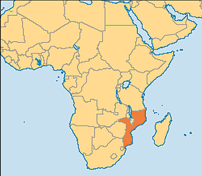
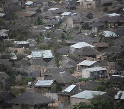
What do you think life would be like if you were a 12 year old boy living in Mozambique?
Uivas Michael
Select 4 or five different times throughout an average day, and speculate what Uivas, a 12 year old boy in Mozambique, might be doing at those times. Make your predictions based on previous knowledge. Don’t just Google this!
Create a chart like the one below to record your answers:
| Time | Uivas Michael's Activities |
|---|---|
| 7:30 a.m. | wake up, shower, brush teeth, have breakfast (cereal and toast) and get ready as the school bus picks up at 8:15 a.m. |
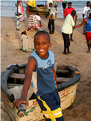
Uivas Michael
Time for Kids
Once you have completed this above task visit the Time Magazine Feature. Make sure that you click on the clocks underneath Uivas Michael’s photograph to reflect on how YOUR perceived typical day for this 12-year-old boy compares to Uivas’s reality.
A Girl's Life
Now try to think about what life would be life for a 12 year old girl living in a periphery country in Africa. Complete the same task as above by adding an additional column to your chart and speaking to the activities in her average day.
Examine the Factsheet below. Click on the coloured titles to access facts.
Although this video is not brand new, the message is still important. There has been some progress in some of the African nations but more needs to be done. According to The Girl Effect Organization there are 600 million adolescent girls living in poverty in the developing world. The Girl Effect Organization believes girls can thrive when given education, protection, health care, access to training and jobs skills. When girls thrive those around them also thrive.
How well did you do at predicting the daily life of these 12 year-olds?
Did your perspective differ after reading the article about Uivas and watching the video and reading the fact sheet about females in Africa?
Were you more accurate with your predictions of one gender over the other? Why do you believe that is?
Lastly, we will compare what life would typically look like in Uganda, Africa.
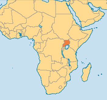
The data below should provide you with an overview of life in Uganda for a typical male and female. Rather than repeating the processes of estimating the person’s typical day, just reflect on how it is different from a child to an average adult and how life would differ between a male and female. How have the responsibilities changed and what might be their outlook on life from the perspective of a typical adult in Uganda?
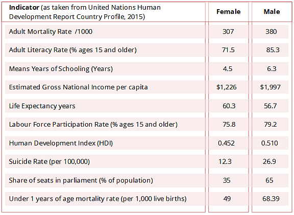
In the above chart, the Human Development Index (HDI) is a summary measure of the average achievement in key dimensions of human development: a long and healthy life (Life Expectancy), being knowledgeable (Literacy Rate and Expected Years of School) and having a decent standard of living (Gross National Income per capita). The scores for the three dimensions are translated to a value between 0 and 1 (0 being the lowest human development and 1 being the highest).
Comparatively also reflect on this information below:
 Infographic
To demonstrate your learning from this unit of study, you will create an Infographic of what life would be like living in an African country (of your choice) from the perspective of either a male or female, a child or adult (you choose gender and age of the person).
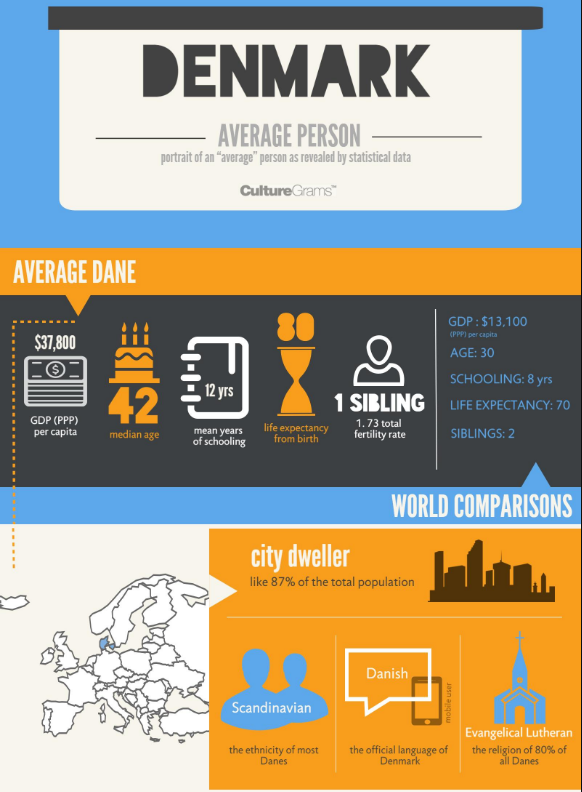
An example of an Infographic related to this topic can be seen below:
An infographic (information graphic) is a representation of information in a graphic format designed to make the data easily understandable at a glance. People use infographics to quickly communicate a message, to simplify the presentation of large amounts of data, to see data patterns and relationships, and to monitor changes in variables over time. Source
You can create an infographic using many different websites and/or software. In the video below Canva is used to create an Infographic and shows you the basics of creating an Infographic. Canva requires you to set up a free account. You may choose a different piece of software or another website; please confer with your teacher on your choice.
The first task is to select a country. You may choose one that you know basic information about, or one that is relevant to your own personal history or that of your community, or you may choose at random.
In order to create your Infographic you will need to complete some in-depth research. This will help you gather the statistics that will become the content of your infographic. To get you started the following list of resources may be of use to you. This is not a comprehensive list but is a great place to begin your research.
- The World Factbook
- Human Development Index
- Gender Development Index
- Quality of Life Index
- Laws on Homosexuality in African Nations
- Corruption Percentage Index 2015
- Freedom House Ranking
- Crime Index for Country 2016
Do not limit yourself to the examples provided above; feel free to use any other source to collect data relevant to your person.
| Does your infographic include... | Check |
|---|---|
| Name and location of the country within Africa? | |
| Gender and age of your example person? | |
Relevant Data including at least one from each of the following areas:
|
|
| Information about human rights issues (e.g., gender equality, corruption)? | |
| Information about food security (e.g., quality, quantity and affordability)? |
Once you have completed your infographic, you will use the information gathered to conduct a 2 page maximum written analysis (i.e., why you selected the data and images to depict what life would be like in the country and for the person you have selected).
Analysis Guiding Questions:
- Based on the data and infographic you created, discuss what life is like currently for this person in the country that you chose.
- Is there opportunity to change this predicted life path?
- Identify and describe the best approach for this change.
- Make recommendations on what you feel the government of your selected country should do to improve the life of this individual. If those recommendations were put into practice, make a prediction for how life would change for this person 20 years from now.
- Describe what developed countries could/should do to help this country improve the life of its citizens. In essence - is there a moral imperative for developed countries to help less developed countries?