Organization of Data For Analysis
Types of Data
MINDS ON
 Record Your Thoughts
For each of the following graphs, describe one conclusion that you could take from it:
1) Out of the people who reported incidents of racial profiling in Ontario in the last 12 months, the following is found:

2) The times it takes for surveyed students to get to school is recorded and summarized as follows:
3) For each of the students surveyed amount the time it takes to get to school, they were asked how many absences they had:

4) 3 Coins are flipped multiple times and the number of heads were recorded each time and summarized:
ACTION
Statistics can be categorized into many different types. Those types of data will tell you if you can organize it into percentages, rank the data and calculate an average, or draw a line of best fit and predict future outcomes. The first major distinction you will make is if the data is categorical or numerical.
Categorical Data
What is the colour of your eyes? What gender do you self-identify with? How would you rate your perceived mental health? These are all examples of categorical data.

Definition: Categorical data is data that does not take a numerical value, but instead has values that are qualitative or are categories.
We can display categorical data in a bar graph or a circle graph.
Ordinal vs. Nominal
There are two types of categorical data, ordinal and nominal.
Ordinal Data
Definition: Ordinal data is categorical data that can be ranked in a logical way.
 Ordinal Data Examples
- To what extent do you agree with the following statement: School spirit is present in your school.
- Strongly Agree
- Agree
- Somewhat Agree
- Somewhat Disagree
- Disagree
- Strongly Disagree
The data that this would collect is referred to as ordinal data as it makes sense for us to rank it when displaying the data. It is useful to convert ordinal data into a number, and perform calculations to summarize the data.
Nominal Data
Definition: Nominal data is categorical data that has no apparent order to the data.
Nominal Data Examples
- What is your favourite sports team? This would also collect nominal data. Alphabetical order would not be used as a justification to consider data ordinal.
Displaying Categorical Data
Categorical data, both nominal and ordinal can be displayed in either a bar graph or a circle graph. If ordinal data is displayed in a bar graph, the bars should be in the order that makes sense with respect to the data.
Record Some Examples
- Find an example of nominal categorical data by doing an internet search for circle graphs and justify (definition:by referring to the definition.) why the data is considered nominal.
- Find an example of ordinal categorical data by doing an internet search for bar graphs and justify (definition:by referring to the definition.) why the data is considered nominal.
Numerical Data
How many days a week do you work? How long does it take you to get to school? The data collected by both of these questions would be numerical data. There are two types of numerical data: continuous and discrete.
Continuous vs. Discrete
The difference between the two is whether or not they are obtained by measuring or counting.
Continuous Data
Definition: Continuous data is data that is obtained by measuring. You can measure data in different ways, including time and distance. Because there is always a data point that can exist between two data points and the possibility of infinite data points, measured data is continuous and organized into intervals.

Example
How long does it take you to get to school? Your answer here could be 20 minutes for example. Say the intervals the data was being organized into were: 15-20 minutes, 20-25 minutes and 25-30 minutes. What interval would your time go into? You would have to look at the accuracy of your time. As a continuous data point, 20 minutes is either higher than 20 (20.000000001 for example) or lower than 20 (19.999999999 for example). So you would always be able to decide which interval you belong to.
Discrete Data
Definition: Discrete data is data that is obtained by counting. This type of data was what you focused on in the first half of this course. Discrete data points, unlike continuous ones, do not have points between points. There are a finite number of possibilities.
Examples
- How many heads do you get when you flip a coin 3 times? The only possibilities are 0,1,2 and 3. There are no values between these.
- What percent did you score on your G1 driver's test? Here, even though the numbers can be decimals, they were obtained by counting the score. Making the score a percent does not change it from a discrete data point to a continuous one. Even if the instructor used half or quarter points, it is not possible to score every value on the number line (even decimals) between 0 and 40.
Displaying Numerical Data
Numerical data is typically displayed with a bar graph or a histogram. There is a constant debate as to the difference between the two and which to use. Categorical data can be displayed as a bar graph but not a histogram. Continuous data can be displayed in a histogram but not a bar graph. Discrete data can use both a bar graph and a histogram. Do you see the confusion?
The simplest way of thinking about this is histograms are used for continuous data and bar graphs are used for discrete data.
In Unit 3 of this course, you displayed probability distributions in a bar graph. It is possible to display them in histograms, although we did not do this. You can also display discrete data as a frequency (total number of each outcome) and as a percentage. Each of these displays will look very similar and result in the same conclusion.
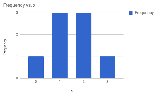
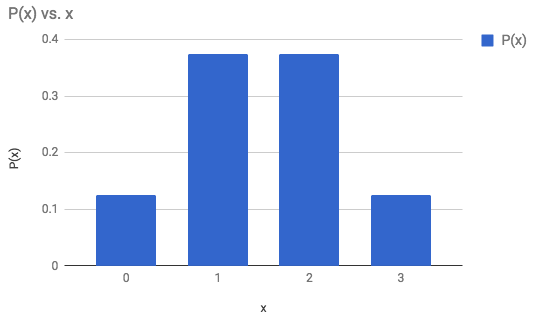
Example
The following outcomes are the number of heads when flipping 3 coins. Display as a frequency bar graph, frequency histogram, probability bar graph, and a probability histogram: 3, 2, 1, 2, 0, 1, 2, 1
Frequency Bar Graph
Probability Bar Graph
|
Frequency Histogram 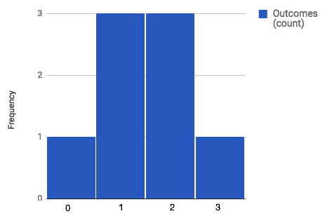 |
Probability Histogram 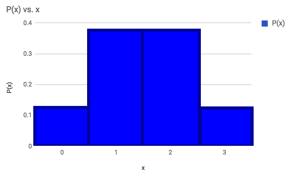
|
Note: The following video will demonstrate how to create these graphs in a spreadsheet. Editing was done in Paint to put the labels on the frequency histogram in the center and to put the lines on the probability histogram.
Record Your Observations
What do you notice about the 4 graphs above? Would any of them give a different conclusion?
Conclusion
75% of the time 1 or 2 heads came up.
It is useful to say that the probability histogram, where each of the bars have a width of 1, demonstrates the probability as the area of each of the bars. This is a much more useful concept when we come to probability histograms for continuous data later in the course.
Histograms are much more useful, when displaying continuous data.
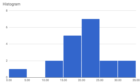
Example
The following are times that students commute to school. To put an emphasis on the fact that the data is continuous, the data is recorded to 3 decimal places and represents the number of minutes: 23.405, 24.774, 27.344, 21.412, 12.280, 26.799, 16.309, 15.857, 22.287, 2.521, 17.651, 13.518, 30.282, 18.478, 22.705, 19.999, 30.605, 20.835.
The following video demonstrates how it was created:
Conclusion
11 of the 19 respondents took 20 minutes or more to get to school.
Record Some Examples
- Find an example of discrete numerical data by doing an internet search for bar graphs. Share the graph and justify (definition:by referring to the definition.) why the data is considered discrete. State one conclusion from the graph.
- Find an example of continuous numerical data by doing an internet search for histograms. Share the graph and justify (definition:by referring to the definition.) why the data is considered continuous. State one conclusion from the graph.
Microdata vs. Aggregate Data
One final difference in data can be seen in the last example.
Definition: The individual data points given are called microdata. Microdata is incredibly useful because you can go back and make calculations on all of the individual data.
If you had a chart of data already organized into intervals, without the original data set, this is an example of aggregate data.
Definition: aggregate data is data that has been summarized in some way where you can't know what the original microdata was.
The data from the histogram above, could be written in a table:
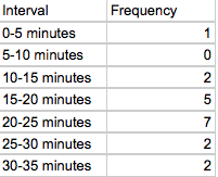
And if the original data was not given or lost, it would be referred to as aggregate data.
One final distinction when analysing data is not so much in the data type, but when displaying numerical data.
One Variable Data Sets vs. Two Variable Data Sets
If you look at the bar graphs, histograms, and circle graphs, they all look at one variable at a time and display the number of times or percentage of times an individual point or interval is counted. These are displays for a one variable data set. We have ways to summarize one variable data sets as well. Average is one of those ways, and additional ways will be explored in the next unit.
If you want to compare two numerical variables to each other, you don't use histograms and bar graphs, you use scatterplots.
From before, we had the one variable of commuting times to school. Now, say we collected the student absences for each student as well. This becomes the second variable:
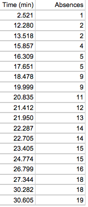
The scatter plot would be as follows:
Conclusion
As the time it takes to get tp school increases, so does the number of absences.
There will be a focus on the displays and analysis of one and two variable data sets in the next unit.
CONSOLIDATION
 Application and Thinking
Use Stats Canada to find a data set to display. Create a graph and make one conclusion based on the graph. Watch the following video for some assistance.