Continuous Probability Distribution: The Normal Distribution
The Frequency Polygon
MINDS ON
In this activity, you will learn about polygons made from histograms and how efficient the polygons are at approximating area of rectangles. The following video is related to this idea, and is a really neat application of polygons.
ACTION
The Frequency Polygon
Recall that the frequency histogram describes the number of data points in a given interval.
Definition: The frequency polygon connects the midpoints of the tops of all of the bars on a histogram, creating a polygon that approximates the frequency histogram.
 Record Your Work
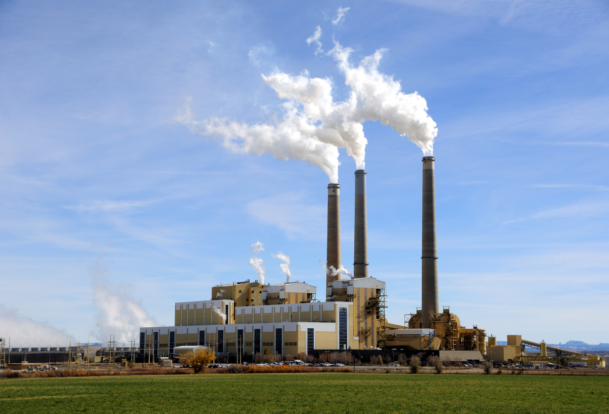
Using this data for CO2 emissions of coal plants in the United States seen in Unit 6, follow the instructions to learn about the frequency polygon.
- Open a new window and go to Geogebra.
- Watch the following video to add the data to a spreadsheet and create a histogram:
- Save a screen capture of the frequency histogram and polygon when the interval size is 1.
- Save a screen capture of the frequency histogram and polygon when the interval size is 0.1.
- Save a screen capture of the frequency histogram and polygon when the interval size is 0.01.
- Looking at the 3 graphs, which polygon would better represent the data? Take notice of where the bars go above the polygon line and where there is white space between the polygon and the bars.
The point of the above exercise was for you to see that smaller interval sizes can make the polygon better approximate the actual data or, in other words, minimize the area that the bars are above or below the polygon.
However, you can't just make the intervals as small as possible, as in when you made the interval size 0.01 for the CO2 emissions data. Just as when you are building a histogram, there is a reasonable interval size based on how spread out the data is, how much data was collected, and how precisely (definition:How many decimal points were used when collecting the data?) the data was collected.
Area Under the Polygon
From the last activity, you were able to calculate probabilities on any interval by finding the area of the bars that would span that interval. This was made possible when the total area is equal to 1. The frequency histogram can be changed by technology into a relative frequency histogram, giving the probabilities/percentages of data in each of the given interval. The probabilities/percentages can be read off the corresponding frequency table.
Record Your Work
Returning to Geogebra and the data for CO2 emissions of coal plants in the United States, set your interval size of the histogram to 0.1. You can also have the Histogram start at 1.9.
- Click to display the frequency table, histogram and polygon.
- Change from "Count" to "Relative." What happens to the shape of the histogram and polygon? What happens to the numbers on the vertical axis?
- The relative frequency table shown below now gives the percentage of data that lies in each interval. What is the probability that a coal plant is between 3.6 and 3.7 million tonnes of CO2 emissions each year?
- Change from "Relative" to "Normalized." What happens to the shape of the histogram and polygon? What happens to the numbers on the vertical axis?
- The "Normalized" function in Geogebra changes the graph to a probability density graph where the entire area under the polygon adds to 1. This now allows you to find the probability that a data point lies in a given interval by finding the area under the curve in that interval. What is the probability that a coal plant is between 3.6 and 3.7 million tonnes of CO2 emissions each year? Calculate by finding the area of the rectangle using the width of the interval as the base and finding the height from the table or the graph.
Now, you may ask, why do we need to make a probability density curve and have the area under 1? A suitable way to find the probability that a random point is within an interval is to add up all of the relative frequency/probability/percent amounts in each interval that is included. If you only wanted to include a portion of the interval, you could just add that proportion of the percent that the chart says.
The key about the polygon is, you can find a mathematical function that approximates the polygon, and you can use technology that uses higher level mathematical processes (definition:The concept of integration is an extension from Calculus and an application of integration allows you to find the area under the curve between two points.) to find the area under the curve on any given interval.
| Term | Meaning | Use |
|---|---|---|
| Frequency Histogram | A histogram that displays the intervals in which the data points lie on the horizontal axis and the total number of data points in each interval on the vertical axis. | Shows the distribution of the data and the modal interval. |
| Frequency Polygon | The polygon that connects the midpoints of the tops of the frequency histogram bars. | Approximates the frequency histogram. |
| Relative Frequency Histogram | A histogram that displays the intervals in which the data points lie on the horizontal axis and the percentage of data points in each interval on the vertical axis. | Shows the probability that a data point lies in one of the given intervals on the vertical axis. |
| Relative Frequency Polygon | The polygon that connects the midpoints of the tops of the relative frequency histogram bars. | Approximates the relative frequency histogram. |
| Probability Density Histogram ("Normalized" in Geogebra) |
A histogram that displays the bars in a way that their areas are equal to their relative frequencies/probabilities/percentages | Used to create a probability density polygon. |
| Probability Density Polygon/Curve | The polygon that connects the midpoints of the tops of the probability density histogram bars. | When the polygon can be approximated with a mathematical function, technology that uses calculus can find the area of any interval. |
Now, although finding areas with these complex mathematical processes are not part of this course, you are going to explore one mathematical function that approximates a good amount of situations, we call it, suitably, the "Normal Curve."
The Normal Curve
The data for CO2 emissions above was generated artificially from information about coal plants in the United States. The 486 data points were generated artificially so that they would create an average of 3.5 million tonnes of CO2 emissions each year and a sum of 1.7 billion. After generating the probability density polygon, you can click to see the normal curve:
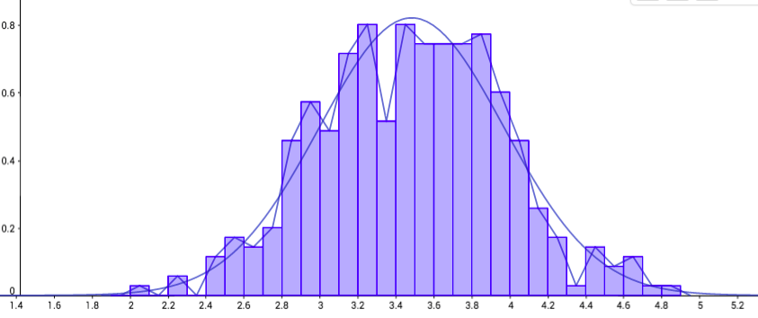
The equation for the curve is somewhat complicated, as an exponential equation with a quadratic exponent.
Fortunately, to make it more accessible for people to use, it has useful properties and a chart that shows the area of all values less than a given point.
You will learn how to use this chart in this unit.
For now, you will take a moment to explore where we have already seen this shape, in discrete probability distributions.
Binomial and Hypergeometric Distributions
Explore the following interactive which will allow you to simulate both the Binomial and Hypergeometric Distributions.
BinomialHyperNormal
Recall, the Binomial distribution is used when trials are independent. You will choose how many objects to take and the percentage of the objects that are winners.
For the Hypergeometric distribution, trials are dependent, often because objects are not replaced. You will choose how many total objects there are and how many of them are winners.
For both, you will explore the shape of the graph that is made from the number of successes and the probability of success.
Record Your Work
Using the interactive answer the following questions.
- For the Binomial Distribution, what do you notice happens to the shape of the graph as you increase the amount of objects that you select?
- Does this shape change for different probabilities of a successful trial? What is the same and what is different?
- For the Hypergeometric Distribution, what do you notice happens to the shape of the graph when there are more marbles in the bag and more selected?
- Does the shape change when there are more or less green balls in the bag total? Note that you can't select more marbles than there are green in the bag. What is the same and different when you change the probability of selecting a green marble?