Communicating

Communicate Ideas, Procedures, and Results in a Variety of Forms
You can communicate your ideas throughout this course by using good, detailed connections.
Online Discussions
If you’re responding to a classmate’s work, remember that communicating online is sometimes different from talking to someone in person. Here are some tips to participating in online class discussions.
Netiquette
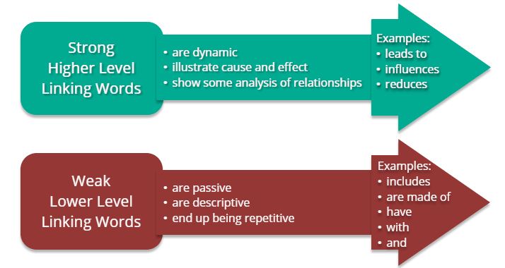
Participation and Feedback in Discussions
The following graphic offers some guidelines to help make your responses in discussions more effective.

Graphic Organizers
Venn Diagram
Many concepts in Biology have similar sounding names but different definitions. Others concepts are similar in terms of a common concept but have different details. A good way to show similarities and differences can be to use a Venn diagram.
Frayer Model Diagram
An example of a Frayer Model diagram is below.

T-Chart
These charts are useful when comparing two related concepts or determining the pros and cons of an issue.
If you want to view any links in this pdf, right click and select "Open Link in New Tab" to avoid leaving this page. (View the original article.)
Concept Mapping
Concept mapping is a great way to show many details, how they’re connected together, and your level of understanding of them. Read the article, An Introduction to Concept Mapping.
If you want to view any links in this pdf, right click and select "Open Link in New Tab" to avoid leaving this page.
This video will walk you through the concept mapping process.
Fishbone Diagram
In some instances, a change can be caused by multiple factors. A good way of organizing this information is called a Fishbone diagram. This type of graphic organizer is also useful for identifying the causes of a problem as part of a problem solving process.
Below is an example of a Fishbone diagram.

Double Bubble
When comparing two processes with multiple similar concepts it’s often useful to organize similarities and differences in a Double Bubble diagram.
Discussion Web
The discussion web organizer prompts you to consider and present information on both sides of your chosen issue.
- Identify the issue you are examining in the centre of the organizer. It is easier to identify advantages and disadvantages if you can state your issue as a question.
- On the right side of the organizer list advantages, or “pros”, for this issue and make sure to support each advantage with specific evidence or details that further explain your reasoning.
- On the left side of the organizer list the disadvantages, or “cons”, you see and once again support your thinking with specific evidence and/or details that explain your reasoning.
- Once you have considered both sides of the issue, the box labelled “conclusion” allows you to share your opinion on this issue using facts from both sides.
Below are two examples of a discussion web organizer.


Use Appropriate Formats to Communicate Results
Lab Reports
Use this guide, Science Laboratory Report Outline, to help you to complete a full lab report.
If you want to view any links in this pdf, right click and select "Open Link in New Tab" to avoid leaving this page.
Guidelines for Making a Data Table
(modified WGBH Education Foundation)
In most cases, the independent variable (that which you purposefully change) is in the left column, the dependent variable (that which you measure) with the different trials is in the next columns, and the derived or calculated column (often average) is on the far right.
Your title should clearly state the purpose of the experiment (e.g., The effect of ____ (independent variable) on ______ (dependent variable).


Graphing
Using a graph to show your results is a good way to quickly identify patterns in your data. You can use graph paper, Google Sheets, Microsoft Excel, or an online graphing source like NCES Create a Graph shown below.

Look over these instructions to make your graphs effective tools for communicating your findings. Read the following article, Scientific Graphing.
If you want to view any links in this pdf, right click and select "Open Link in New Tab" to avoid leaving this page.
Biological Drawings
Biology labs often require you to create a biological drawing of the specimen you are observing.

There are some basic rules that must be followed when creating these diagrams.
| Checklist Items | |
|---|---|
| Ensure the appropriate title is at the top of the page. | |
| Your diagram must be done in pencil on plain, unlined paper. | |
| You should have created a large, clear drawing. Have you used most of the space available? | |
| Your diagram must represent what was observed. | |
| The label lines must be drawn with a ruler and must be parallel where possible. | |
| Your labels line up in a column on the right hand side. | |
| Stipples (dots) are used to show contrast. No shading! | |
| Approximate magnification is in the lower, right corner. | |
| Your labels are neat with accurate spelling. |