Resource Room
Communicating (C)
MINDS ON
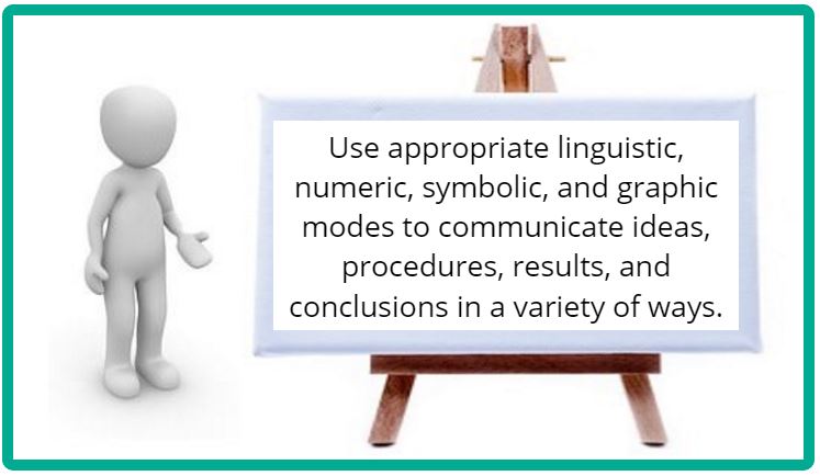
Communicate Ideas, Procedures, and Results in a Variety of Forms
You can communicate your ideas throughout this course by using good, detailed connections.
Graphic Organizers
Venn Diagram
Many concepts in Biology have similar sounding names but different definitions. Others concepts are similar in terms of a common concept but have different details. A good way to show similarities and differences can be to use a Venn diagram.
Continue writing content here.
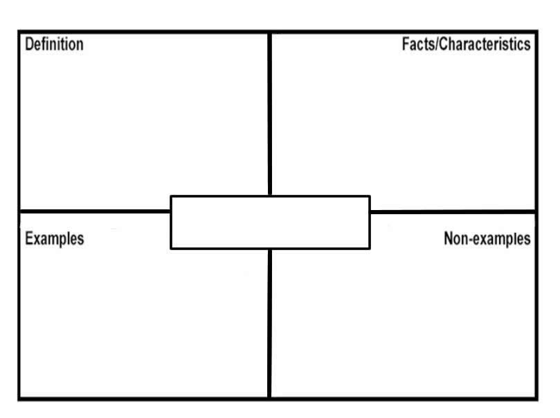
Frayer Model Diagram
Click on the image to download a fillable Word file.
Concept mapping is a great way to show a lot of details, how they’re connected together, and your level of understanding of them. Read the article, An Introduction to Concept Mapping.
If you want to view any links in this pdf, right click and select "Open Link in New Tab" to avoid leaving this page.
Fishbone Diagram
In some instances, a change can be caused by multiple factors. A good way of organizing this information is called a Fishbone diagram. This type of graphic organizer is also useful for identifying the causes of a problem as part of a problem solving process.
Click on the image below to download a fillable Word document.

Double Bubble
When comparing two processes with multiple similar concepts it’s often useful to organize similarities and differences in a Double Bubble diagram.
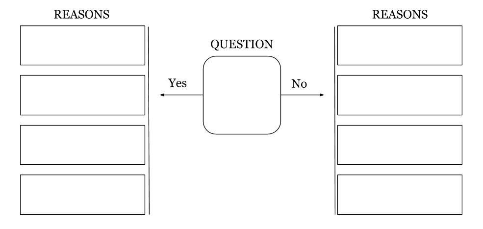
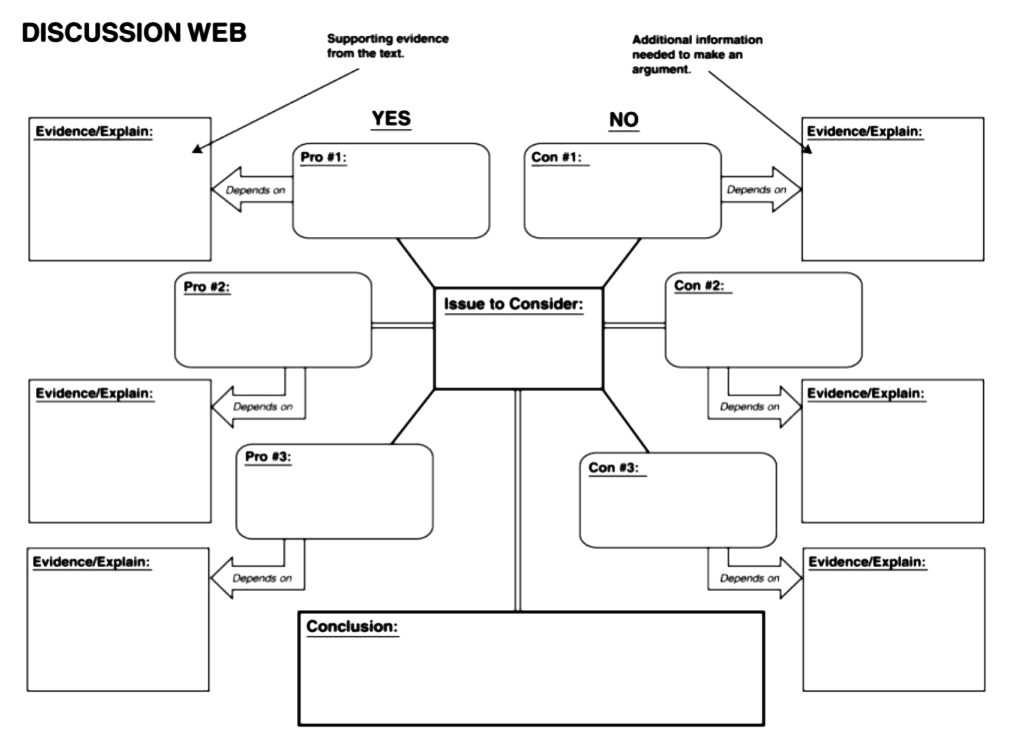
Discussion Web
The discussion web organizer prompts you to consider and present information on both sides of your chosen issue.
- Identify the issue you are examining in the centre of the organizer. It is easier to identify advantages and disadvantage if you can state your issue as a question.
- On the right side of the organizer list advantages or “pros” for this issue and ensure to support each advantage with specific evidence or details that further explain your reasoning.
- On the left side of the organizer list the disadvantages or “cons” you see and once again support your thinking with specific evidence and/or details that explain your reasoning.
- Once you have considered both sides of the issue the box labelled “conclusion” allows you to share your opinion on this issue using facts from both sides.
Click on either example of a discussion web organizer to download a fillable Word document.
Use Appropriate Formats to Communicate Results
Lab Reports
Use this guide, Science Laboratory Report Outline, to help you to complete a full lab report.
If you want to view any links in this pdf, right click and select "Open Link in New Tab" to avoid leaving this page.
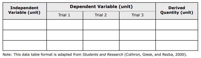
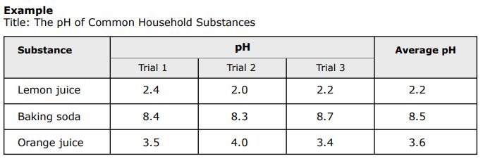
Guidelines for Making a Data Table
(modified WGBH Education Foundation)
In most cases, the independent variable (that which you purposefully change) is in the left column, the dependent variable (that which you measure) with the different trials is in the next columns, and the derived or calculated column (often average) is on the far right.
Your title should clearly state the purpose of the experiment (e.g., The effect of ____ (independent variable) on ______ (dependent variable).
Graphing
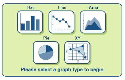
Using a graph to show your results in a good way to quickly identify patterns in your data. You can use graph paper, Google Sheets, Microsoft Excel, or an online graphing source like NCES Create a Graph shown below.
Look over these instructions to make your graphs effective tools at communicating your findings. Read the following article, Scientific Graphing.
If you want to view any links in this pdf, right click and select "Open Link in New Tab" to avoid leaving this page.