HHS4U
Unit 1: How do Social Scientists do their Work?
Activity 4: Trends, Issues and Challenges
As you have learned, social scientists attempt to examine patterns and trends in human behaviour and society. To do so, they need to gather and interpret data. Data is defined as “individual facts, statistics or items of information.” There are two main types of data that can be collected and displayed to demonstrate a pattern or trend: qualitative or quantitative.
How would you describe this picture? Social scientists would describe the golf balls in two different ways, depending on the type of data they were gathering.
Qualitative data is information that provides a description of something, or in essence, a quality of something. For example, the golf ball is white and round.
Quantitative data is information that defines something with a numerical value or number, or in essence a quantity of something. For example, there are 5 golf balls, and each is 4 cm in diameter.

Golf Balls and Data
However, social scientists do not examine things; they examine people, events and situations. Therefore, qualitative data might be used if a researcher wanted to report on a person’s feelings or reactions to a situation using words. Quantitative data would be used if they wanted to report how many people experienced something, or how trends such as birth rates have changed over time.

For instance, if researchers had children watch an hour of television, qualitative data might be gathered on how children reacted to witnessing violence. The quantitative data researchers may collect might be how many minutes of violent actions were viewed by the children in total.
In future lessons, you will be examining how to collect and perform research in social science. In this activity you are going to examine how social scientists display and interpret quantitative data to reveal patterns and trends in society.
Using Tables and Graphs
Basic numbers or findings can often be displayed in a chart or a table. A chart or table is made up of columns and rows, and is a quick way to present relatively large quantities of data in an orderly fashion. Social scientists can also display patterns and trends using graphical representations. This presents the information to the readers in a clear and concise manner, and is a bit more attention-grabbing and visually appealing than a simple table or chart.
Tables
Tables are often used if precise values or numbers are necessary, or if there are many different informational items that must be included.
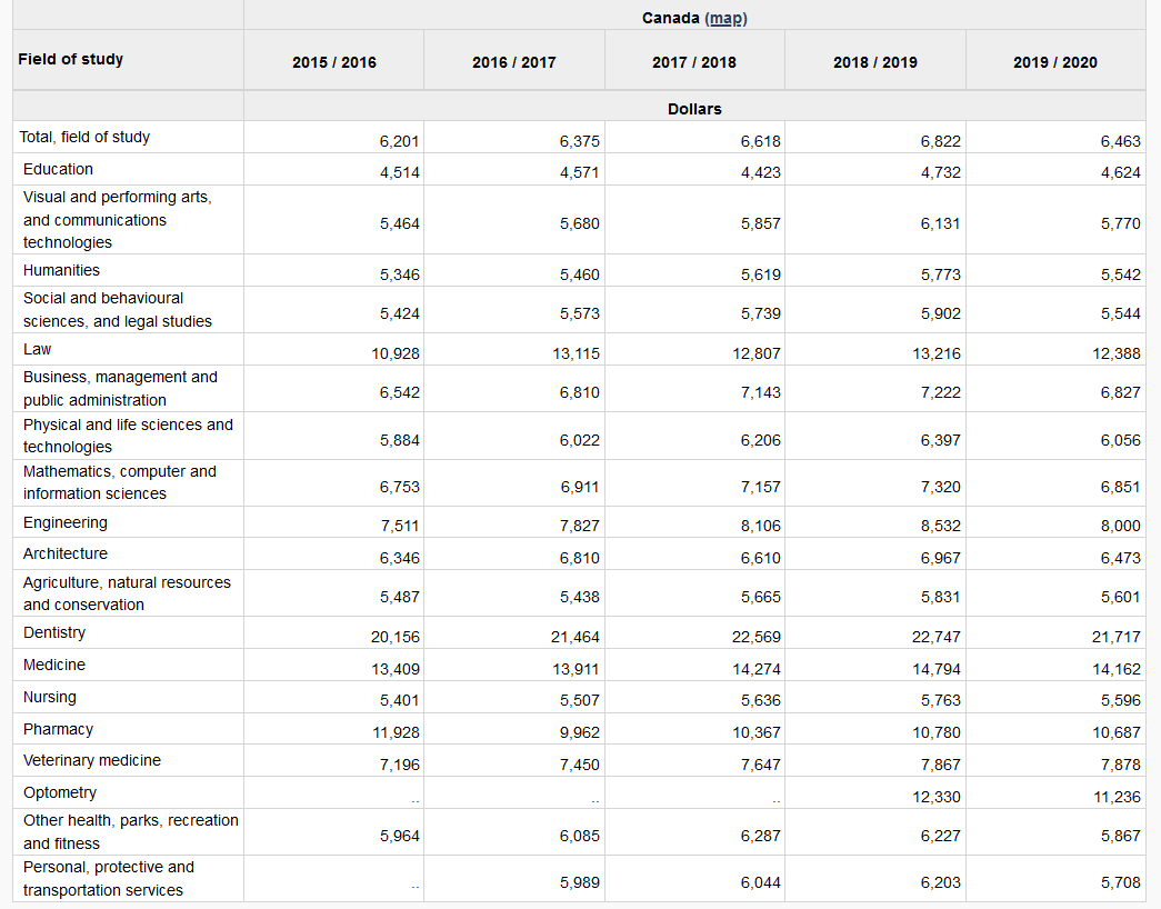
For instance, the table below is used to compare undergraduate tuition fees for full time Canadian students, by discipline.
Graphs
Social scientists may present information in a graph if they want to show an overall trend or the shape of the data. For instance, it may reveal an upward slope, or an increase and then a sharp decline. It may also be used to show how data changes over time or as a point of comparison for other items. This Statistics Canada resource provides detailed information on how to use a graph, why they are used, and when they should not be used to display data:
 Supplementary Reading
For additional information on line graphs, see this Khan Academy video below:
For additional information on bar graphs, see this Khan Academy video:
The data in the table and graph that you analysed by completing the quizzes presented information that should have helped you to see some patterns and trends related to the topic. But, as social scientists, the next step is to ask questions. Why is the data significant or important? Why might this have happened? Was something going on in society that would explain or relate to this topic? Is there anything else you need to know? Do you have any other questions?
 Identifying and Interpreting Data
Your task is to select one of the topics (e.g., Paid Work, Economic Well-Being) listed at Statistics Canada, and then view one table and one graph found under the term “charts”. Take a screenshot of each.
For each table and graph answer the following:
- What is the title used by Statistics Canada?
- What date range is covered?
- What are the highest and lowest values? Do those high and low values demonstrate a pattern or trend? (Hint: Think about the title. What does this value tell us about the title or topic being studied?)
- Identify one other interesting finding that the data reveals. (Hint: Again, think about the title. Find one piece of data that tells the reader something about this topic, the people/place being studied, or the dates of the research.)
- Identify one question you have about this topic or data. Examples include:
- What do you need to know?
- Is this information important?
- Why might this have happened?
- What do you still need to know?