Biological Processes and Interactions
Cellular Transport: Insides vs. Outsides
MINDS ON
Some Key Terms
Look for these terms in this Activity. You should practice using them as you compose your responses to the upcoming tasks.
Realize, though, that this list is not exhaustive so you should look for opportunities to include other relevant terminology related to cellular transport.
| gradient | substrate | osmosis |
| hypertonic | hypotonic | isotonic |
| passive transport | channel | pore |
| diffusion | active transport | primary transport |
| secondary transport | endocytosis | exocytosis |
Membrane Components
Refer back to your graphic organizer from Unit 1, Activity 4 about lipids, and recall that cell membranes are made of many components: phospholipids, proteins, carbohydrates, and cholesterol. These components work together to allow the membrane to function:
- to protect the cell from its environment,
- to select which substances can enter or leave the cell,
- to allow cell-to-cell communication,
- to perform specific biochemical reactions.
In this Activity we will focus on the membrane’s ability to select which substances can enter or leave the cell. This selectivity of the membrane means that it is semi-permeable (definition:The ability for certain substances to move across a membrane. Permeable means to allow to pass, so impermeable means not allowing to pass.) to substrates: impermeable to some but permeable to others. Selectivity allows the cell to establish an internal environment that is suitable for biological processes to occur. Membranes are also important in maintaining this internal environment, or homeostasis. (definition:The ability of the body or a cell to maintain its internal environment in response to external change.) This internal balance is sometimes called an equilibrium. However, in many cases, homeostasis does not mean that the equilibrium is the same between the inside and exterior of the cell.
 How do small steps lead to changes?
Change 4. Why is it important for the membrane to be permeable to waste but not to let out nutrients?
Spontaneous Movement of Molecules
It’s important, at this time, to remember that many of the cellular processes we are looking at in this Unit involve the interaction of molecules. Often it’s convenient to use words like “need’ or “want” to describe the action of these molecules. But this is not an accurate way to interpret molecular interactions. Instead, it’s better to describe the movement of molecules in terms we will learn about in this Activity.
We have seen earlier that biochemical reactions either use or release energy. It is also true that, in general, order and organization decreases over time. In Biology, many biochemical processes and structures work against this disorganization: cells are far more complex and precisely arranged than a puddle of biological molecules. It takes energy to work against disorder.
by Cronodon
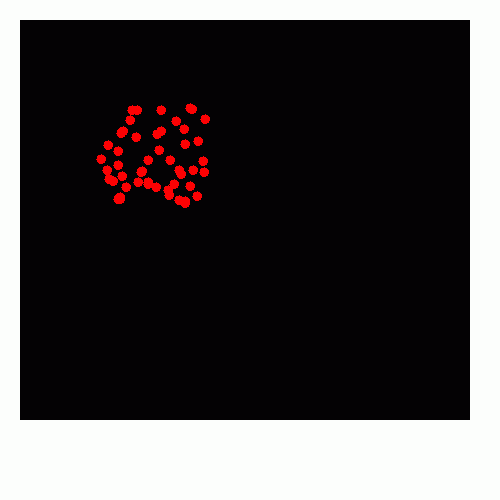
The graphic above show the process of diffusion. (definition:the spontaneous movement of molecules from an area of high concentration to an area of low concentration.) This is an important process that cells use, especially in the movement of carbon dioxide and oxygen in lungs.
Water is another molecule that can move in a similar way, though this is called osmosis. (definition:the spontaneous movement of a solvent through a semi-permeable membrane to an area of great solute concentration.)
How do small steps lead to changes?
Changes 5. Why is it important for plant roots to be more concentrated compared to the soil?
ACTION
Types of Cellular Transport
In the video about osmosis you saw that both diffusion and osmosis were examples of passive transport. Both processes involve molecules moving from an area of higher concentration to lower concentration. We can also say more simply that the molecules are moving along their concentration gradient.
Water moves towards the side of the membrane with greater solute concentration. The concentration of solutes on either side can be described qualitatively as:
- hypertonic - a solution with greater solute concentration than inside a cell,
- hypotonic - a solution with lesser solute concentration than inside a cell, or
- isotonic - a solution with equal concentration of solutes as inside a cell.
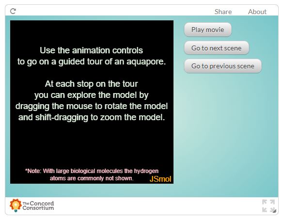
Water is helped to move across a membrane with special integral membrane proteins called aquaporins. You can see how the shape of the quaternary structure of the aquaporin is large enough for only water to pass in this interactive.
Other biological molecules are too large or too hydrophilic to pass through the semi-permeable membrane. Instead, proteins in the phospholipid bilayer allow for them to pass through facilitated transport. (definition:the cellular process of moving molecules across a semi-permeable membrane through an integral membrane protein.)
Methods of Cellular Transport
For each form of cellular transport that is mentioned in the video below, identify:
- what part of the membrane is involved
- whether energy is used, or not
- the direction of substrate movement relative to its concentration gradient
Use a graphic organizer to record your information.
 Tic-Tac-Know
Below is a tic-tac-toe board. Make a straight line (horizontal, vertical or diagonal) by clicking on three words that you can connect in a complete sentence or thought about cellular transport.
|
endocytosis |
active transport |
osmosis |
|
diffusion |
gradient |
energy |
|
phospholipid |
facilitated diffusion |
cytoplasm |
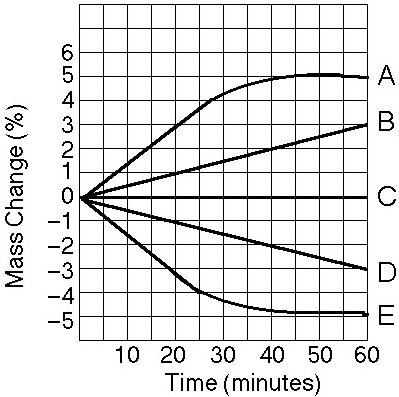
Rate of Cellular Transport
The rate of cellular transport is different depending on the type of transport. You will use details about different forms of cellular transport to interpret and analyse the following graphs.
How do small steps lead to changes?
Interpret and analyse the following graphs about cellular transport.
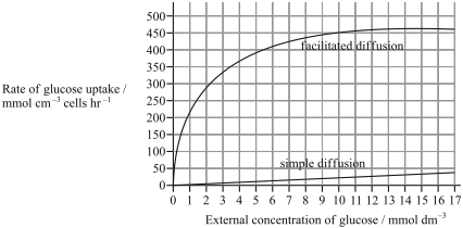
by Jay Reimer
Graph 2

by Blogspot
Graph 3
In all three of these examples the graphed lines show the curves of best fit for the data. But how can we evaluate a graph from an experiment to tell if it’s reliable?
Let’s consider the following results showing the facilitated transport activity of a substrate.
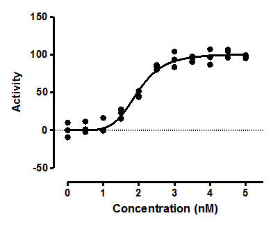
by H.J. Motulsky, "Reparametizing an Equation", GraphPad Curve Fitting
Looking at these results, we can say that overall the results are reliable because most of the data points are either on the curve of best fit or very close to it. We can also look at the negative control: the reaction with no substrate (0 nM). It is expected that with no substrate available the average activity of transport should be zero.
Some of the results, however, do not lie close to the curve of best fit. These results can be explained by errors in the procedure or the way the data was collected. Whatever the explanation, the error must be unique to this result. It wouldn’t make sense to say, for example, that the water used in the experiment was contaminated. If the same water was used throughout the experiment then we would expect that error to change all the results, not some of them.
We will practice evaluating results later in this Activity.
How does understanding change?
In some experiments, Biologists repeat experiments with the same conditions. They then calculate the average for each condition being tested. Only the average results are plotted on a graph.
Understanding 22. Suggest why this method of performing experiments helps to make the results more reliable.
Membranes and Homeostasis
There are many ways that cellular transport across membranes is important to homeostasis. So far in this Activity you have seen how membranes are important in plants to absorb water through roots and in Grade 11 you learned how diffusion is important to how the lungs exchange gases. In both of these cases passive transport is used by cells. However, homeostasis often uses active transport in order to maintain the correct balance of biological molecules inside and outside of cells.
Most cells move sodium ions out and potassium ions in. The process works against a concentration gradient so energy in the form of ATP is used to drive this movement. The following flowchart summarizes this process.
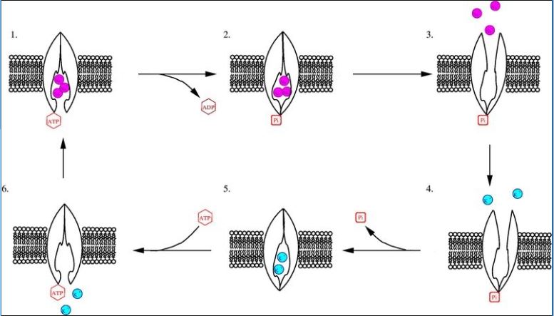
The Na+/K+ pump is a common example of active transport. As 3 purple Na+ ions bind to active sites in the transport protein, ATP is hydrolyzed to move 3 Na+ out of the cell. The transport protein changes shape to release the Na+ ions, exposing new active sites for 2 blue K+ ions. Dephosphorylation of the transport protein changes its shape to move the K+ ions into the cell. A new ATP binds to the transport protein to release the K+ ions, exposing the Na+ active sites again.
The sodium-potassium pump is an example of primary transport. (definition:a form of active transport that directly uses chemical energy.) The imbalance of ions sets up a concentration gradient. Those ions can then use special facilitated transporter proteins that move another substance. This transport is called secondary transport. (definition:a form of active transport that uses the potential energy from the concentration gradient created by primary transport.) Just like in coupled reactions, (definition:a pair of reactions where the products of one reaction are used as reactants for the other reaction.) the products of primary transport are used for the secondary transport.
Methods of Cellular Transport
Add primary and secondary transport in the section describing active transport in your graphic organizer.
An important use of cellular transport in the body is in the kidneys. Inside each kidney are approximately a million nephrons (definition:the functional unit of the kidney that is responsible for regulating solute concentration in the blood.) where the urinary system and circulatory system overlap.

by Dynamic Science
The pressure of the blood from the heart is strong enough to force the water and small solutes, like ions, urea, and nutrients, into the nephron. This fluid is called the filtrate. (definition:the fluid first produced in the nephron caused by pressure filtration and includes both useful and waste solutes.) However, most of the substances in the filtrate should not be excreted as waste and so they must be reabsorbed (definition: the process of water and solutes moving from the filtrate in the nephron back into the blood.) back into the blood. We will explore more about how nephrons produce urine later in this Unit.
Elsewhere in the body, a neuron uses cellular transport to send chemical signal. Recall that neurotransmitters are chemical signal molecules that are hydrophilic. The space between neurons is called the synapse. Therefore, neurotransmitters transmit their signal by binding to the receptors on the postsynaptic neuron.
On the presynaptic neuron side, neurotransmitters are transported out of and back into the cell. This process is summarized in this next interactive from Dr. Stufflebeam and The Mind Project.
A similar process occurs between neurons and other tissue types, like effector muscles and glands, controlled by the nervous system.
Cellular Transport Flowchart
Choose one of the following processes important to homeostasis in the body to describe:
- reabsorption of ions (like Ca2+ or Cl-)
- reabsorption of nutrients (like glucose or amino acids)
- reabsorption of water
- release and reuptake of neurotransmitters
Summarize the steps in that process as a flowchart. You can make your flowchart on paper and take a picture of it, or make it electronically. Remember that the description of the process must:
- be meaningful;
- be well-organized and easy-to-follow;
- show your understanding of the vocabulary.
 Quiz
Quiz
Check your understanding of cellular transport by taking the following quizzes.
CONSOLIDATION
Summary
- membranes control which substances can pass into or out of a cell;
- moving substances with their concentration gradient does not require energy;
- moving substances against a concentration gradient uses energy.
 Investigating Rate of Cellular Transport
You are now ready to complete the experiment for this Activity. You will perform a lab using household materials to investigate the effect of sugar concentration on cellular transport.
Experiment: Rate of Cellular Transport
Materials Needed:
- a sample of a hard vegetable (such as zucchini, potato, or turnip)
- sugar
- tap water
- a kitchen thermometer
- a stopwatch
- teaspoon
- measuring cups
- two small glasses
- a knife
- a ruler
- paper towel
Procedure:
- Cut six sticks of your hard vegetable to measure 0.5 cm x 0.5 cm x 4.0 cm. Rinse the vegetable sticks and pat them dry with paper towel.
- Clean six small glasses. Measure 100 mL of tap water into each glass.
- In the second glass, add 0.5 teaspoon (2.5 g) of sugar. Stir to dissolve the sugar.
- In the third to sixth glass, add 1 teaspoon (5 g), 2 teaspoons (10 g), 3 teaspoons (15 g), and 4 teaspoons (20 g) of sugar, respectively.
- Add one vegetable stick into each glass.
- Leave the vegetable sticks for 24 hours.
- Remove both vegetable sticks. Pat them dry with paper towel. Then, precisely measure their dimensions: length, width and height.
Interpreting the Results:
Make a graph using at data for 5 different sugar concentrations from the class results. Draw a curve of best fit for these results. Interpret the pattern in your graphed results.
Note: the concentrations tested are 2.5%, 5%, 10%, 15%, and 20% sugar solution.
Evaluating the Procedure and Results:
Evaluate the reliability of the results.
If you prefer, you can download a copy of this investigation.